Going bold with contrasting colour schemes to make your stairs stand out

Going bold with contrasting colour schemes to make your stairs stand out

If you are tired of decorating with plain colours and you want your stairs to stand out and be a real focal point in your home, contrasting colours are the way to go. 

This is when you have two or more colours that are totally different. One colour usually is more dominant than the other, so eyes get attracted to it. 

With your hallway, stairs and landing spaces being the places that get used most often as people move around your home, it’s important to pick a colour scheme that you like. Spending the time to do your research and test things out is key. 

Understand the colour wheel

One of the first things we recommend you do is get your hands on a colour wheel and pick out potential colours you like. 

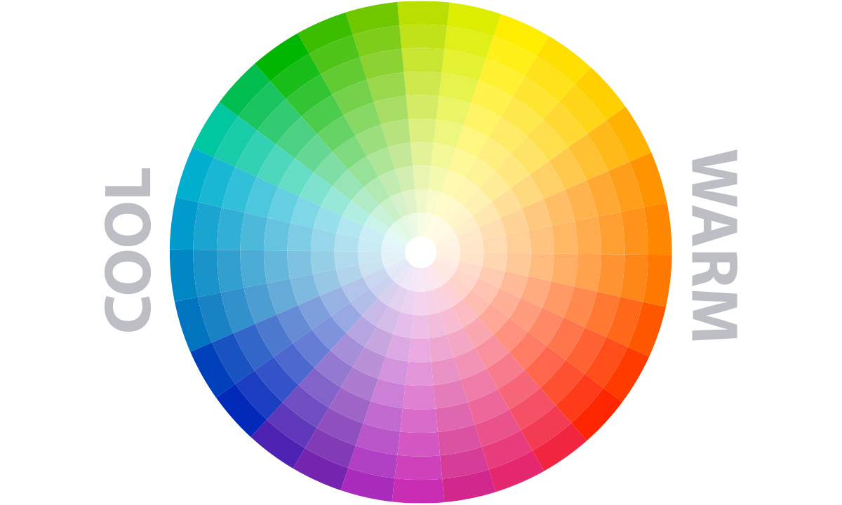
A colour wheel is made up of at least 12 differing shades of tertiary colours – which are mixtures of primary and secondary colours.

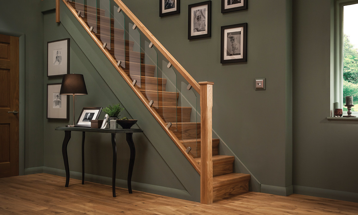
The colours that are directly opposite are contrasting. These are also known as complementary colours. When used collectively, they can really bring a room or space together. For example, reds and greens, blues and oranges, and yellows and purples

If you want to use more than two colours – or even four – you can take corners evenly spaced on the colour wheel for maximum contrast and an even bolder approach. 

If you can’t get your hands on a colour wheel, there are lots of free tools available online too. And like always, there’s an app or two for it too. 

You can still tone it down if you wish…

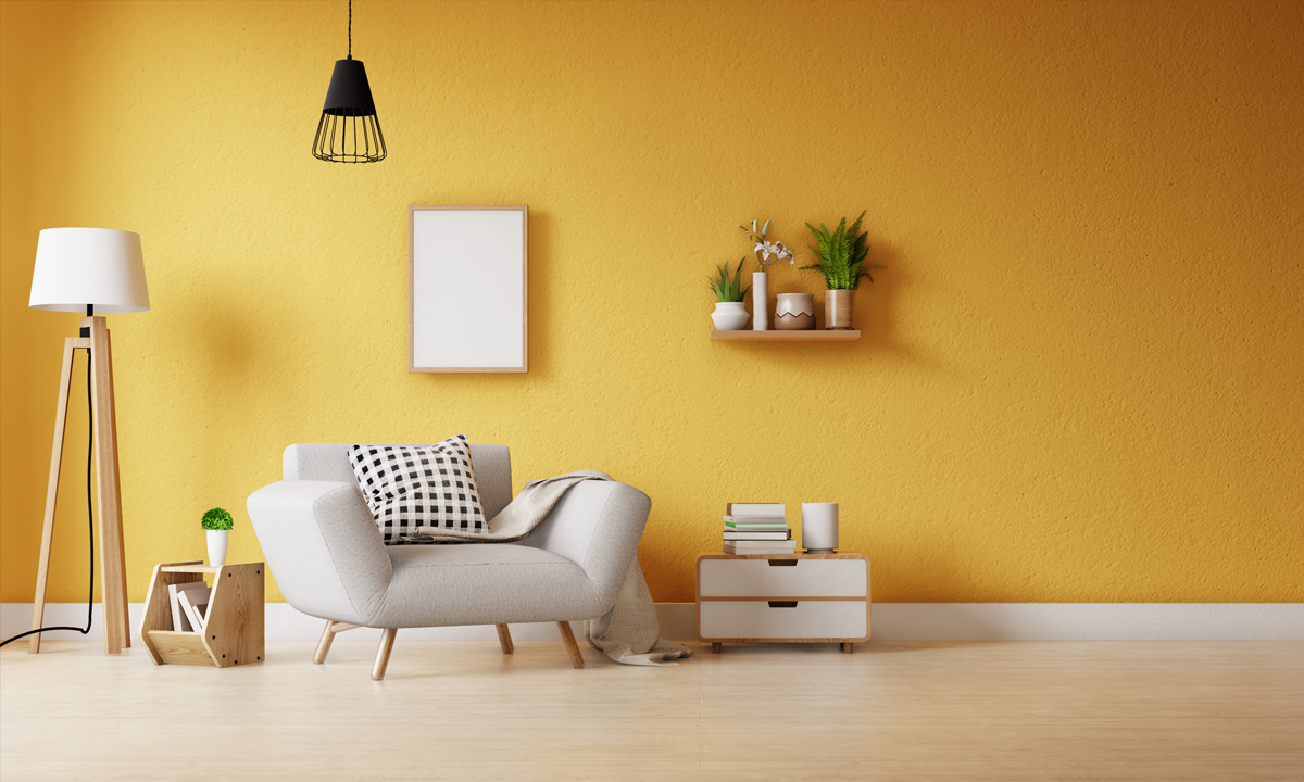
You can go all out if you want but you don’t have to go with the exact colour on your colour wheel. When strong colours are included, it is often best to offset them with neutrals. And you can look at creating different tints, shades and tones by adding white, black or grey. 

These lighter tints will help you provide a neutral colour to go alongside a more vibrant colour, giving the eye something softer to focus on. 

Anything goes so it’s a good idea to experiment a bit. There’s truth in saying ‘nothing matches, but it all works together’.

Going bold with contrasting colour schemes to make your stairs stand out

Going bold with contrasting colour schemes to make your stairs stand out

Bring your staircase to life

Using this colour contrast technique can really bring some fun and vibrancy to your staircase. But what colour scheme you choose depends on the size and shape of the area you’re thinking of decorating. 

For example, bigger and more expansive hallways can feel a bit ‘cold’ so you may want to warm it up with bolder colours such as reds and oranges. Conversely, smaller, tighter spaces might require a bit of subtlety with blues and greens to make the room look more airy. 

Utilise lighting

Natural lighting will have a significant effect on how colours will look in a hallway, staircase or landing, and your shade could end up looking vastly different to how it appeared in the shop. When going bold, we recommend you test a sample of the paint outdoors and test a little in advance on your walls to make sure you’re comfortable with your choice.

If there’s not much natural light, there many ways to lighten your staircase which are highlighted in our ideas and inspiration section.

And if you find that contrasting colours aren’t for you after testing the colours, there are still many ways to get creative with your walls. Take a look at our blog looking at how to get creative with your staircase walls.